Several months ago I bought this very sweet vintage teapot (I think I bought it when I visited Inglewood), which is made in England by Arthur Wood, with a pattern called 'Summertime'. I was really drawn to the stylised floral pattern, and the colour palette of the florals on the yellow glazed teapot - definitely not the usual old-fashioned florals found on English vintage ceramics.
Then a few weeks later in Daylesford I came across this large jug, and instantly recognised the pattern as being the same as the teapot. I thought it was a bit unusual that the jug was white, whilst the teapot had a yellow glaze - and on turning the jug over I learnt the jug was made in New Zealand, and wasn't part of the English Arthur Wood collection.
It's a bit of a mystery how the two pieces have the same pattern (maybe the pattern was licensed for the Australia-Pacific region?) but either way I like that the two pieces don't match perfectly, and they make a great addition to my random collection of vintage chinaware.
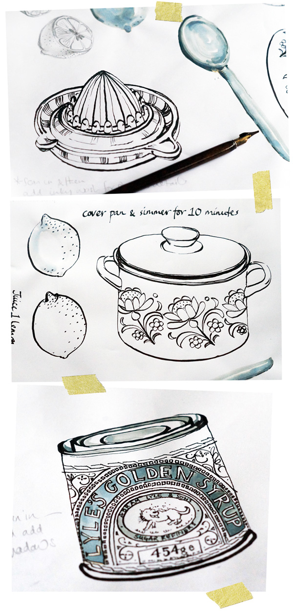
Kitchen sketches & illustrations

things in the kitchen - pots and pans, utensils, food items and condiments etc. The majority
of the sketches have been created using an ink dip pen - I don't very often use a dip pen to
do my artwork, so it's been a fun excercise to practise with this medium and experiment
with drawing in a slightly different way.
As a left-handed person I've had to get special left-handed nibs to use, and I don't think I'm
holding the pen 'correctly', but I like the effect nontheless and I've gradually started to find
my way with how to acheive the quality of line I'm after. I've predominantly used a Speedball
C-3 nib for the outlines, and a much thinner C-6 nib for any fine detailed areas.
Here we go again!
It was just over a year ago that we packed up our life in Melbourne, and did our own little Escape to the Country, moving north and settling in Kyneton. We've absolutely loved making the move out of the city, and have formed great friendships (with many other 'ex-pat' Melbournians) as well as enjoying fabulous local food, wineries, markets and lots of new vintage places to explore.
We've made our life in the country a little more permanent, as a few weeks ago we purchased a house here in Kyneton. And so I find myself again surrounded by boxes, packing up daily life and carefully wrapping treasured items for the short journey across town to our new home.
Many of the items I'm carefully wrapping up aren't worth anything - teacups and teapots found in the bric-a-brac section of the local op-shop, plates gathered at vintage markets and miscellaneous ceramics and kitchenalia from garage sales. However, I'd be devastated if I lost my collection of bits and pieces. If my TV / DVD / bike / kettle / toaster etc breaks - so what - I just get a new one. No big deal. Go to the shop...choose new item.....purchase....bring home. Easy.
We've made our life in the country a little more permanent, as a few weeks ago we purchased a house here in Kyneton. And so I find myself again surrounded by boxes, packing up daily life and carefully wrapping treasured items for the short journey across town to our new home.
Many of the items I'm carefully wrapping up aren't worth anything - teacups and teapots found in the bric-a-brac section of the local op-shop, plates gathered at vintage markets and miscellaneous ceramics and kitchenalia from garage sales. However, I'd be devastated if I lost my collection of bits and pieces. If my TV / DVD / bike / kettle / toaster etc breaks - so what - I just get a new one. No big deal. Go to the shop...choose new item.....purchase....bring home. Easy.
However, my favourite teacup or plate might only be worth $5 - but I bought it because it was different, unusual, individual. I bought it because I loved the pattern, the shape, the colour, the old-fashioned feel and look of it. I bought it because it's not something you find everyday in every high street shop - but because I might never come across that same item ever again. Not so easy to replace.
It will be exciting unpacking and finding new homes for all of our belongings (many of which need a little dusting!) and I'll look forward to sharing some of our new house adventures here. Above is a sneak-peek of the house - we've gone for a cheeky 1970's number. Wish us luck for the move and fingers crossed my ceramic treasures survive the journey!
Little Golden Book - Animal Book
Cats cuddle. Cats purr. Nothing's as smooth as cats' fur.
Mice scuttle. Mice squeak. When the cat's about, Mice sneak.
Owls hoot and Owls blink. No one knows just what Owls think.
I'm always on the hunt for second-hand Little Golden Books, and I've collected some fabulous ones recently. One of my favourites is this My Little Golden Animal Book, which is full of very cute animal illustrations - farm animals, domestic animals, flying animals and swimming animals are all here.
The book is dated 1963 and features little rhyming dities to accompany each animal, with the very sweet illustrations drawn by Moritz Kennel.
Portraits....landscapes....life drawing....and more.....
Little Mr J turned two last week, and I received a surprise birthday card featuring a portrait of him that my dad had painted. The watercolour portrait is only small being on a birthday card, but it captures him (and his best friend, the Jolly cat) perfectly.
I've never really painted portraits, so I'm always in awe of people who can do this as I think it has to be one of the hardest things to paint.
My dad has been updating his blog with recent paintings from his home in Ireland, work from a few years ago whilst living in Southern France and prior to that England, as well as sketches and paintings from his sketchbook. The two paintings below are recent oils depicting moody skies and iridescent landscapes in Ireland.
The scene below is a watercolour landscape of Ireland, and lastly a painting of Norfolk taken from his sketchbook.
Recently my dad has also started some still life classes, painting nudes. You can see more of his figure studies here and here.
I have recently had the opportunity to paint the female figure for only the third time since leaving art-college, more years ago than I prefer to remember. Painting the human figure presents unique challanges very differnt to landscape or still life. It is, I believe, all in the drawing, getting the balance, form and proportions right. There are no straight lines, no definite angles or corners to take measurments from, coordination of eye and hand are paramount.
And lastly here is a video featuring some of his current work. Enjoy!
Post holiday blues
I've been suffering a little bit with post holiday blues, after a beautiful week spent in Queensland. It was fabulous to get away for a few days for a change of scene, and to escape the chilly winter days here in Kyneton.
Mr J had a great time hanging out at the beach, making sand-castles and running into the surf for a paddle. As a child I loved going to the beach for summer holidays, and growing up in England nearly all of my childhood beach trips were in the UK or Scotland (if anyone watches the British TV series 'Doc Martin', this is filmed at Port Isaac in Cornwall - one of the beautiful beaches where I used to go on holiday) It didn't matter about the weather, it was all about being outside all day, discovering and exploring new places, playing on the beach, collecting shells and poking in rock pools - and yes it did involve swimming in the very cold waters surrounding our small island!
It was wonderfully refreshing for us to have a break from work, and to be without computers, emails, train timetables and house chores for a week. Back to reality now with frosty mornings and still un-read emails in the in-box!
Of course I made it a priority to check out a few local op-shops and second-hand places, and my Queensland holiday was complete when I found this rather gorgeous vintage English teacup and saucer featuring an art deco style pattern in tones of greens.
Mr J had a great time hanging out at the beach, making sand-castles and running into the surf for a paddle. As a child I loved going to the beach for summer holidays, and growing up in England nearly all of my childhood beach trips were in the UK or Scotland (if anyone watches the British TV series 'Doc Martin', this is filmed at Port Isaac in Cornwall - one of the beautiful beaches where I used to go on holiday) It didn't matter about the weather, it was all about being outside all day, discovering and exploring new places, playing on the beach, collecting shells and poking in rock pools - and yes it did involve swimming in the very cold waters surrounding our small island!
It was wonderfully refreshing for us to have a break from work, and to be without computers, emails, train timetables and house chores for a week. Back to reality now with frosty mornings and still un-read emails in the in-box!
Of course I made it a priority to check out a few local op-shops and second-hand places, and my Queensland holiday was complete when I found this rather gorgeous vintage English teacup and saucer featuring an art deco style pattern in tones of greens.
Vintage children's chalk-board & lettering set
It's a rather nifty little set - the top of the case is a chalkboard that also doubles as a magnetic board, and on opening the case you find two trays of magnetic lower & uppercase letters and numbers, chalk, a chalk-board rubber and a set of descriptive cards. All housed in its own carry case with handle. Tres chic!
The assorted descriptive cards fit onto the chalkboard, and you can either trace around them with the chalk, or pop the magnetic letters into the blank spaces. You can also just put the letters directly onto the magnetised board and create your own words and sentences - or you can simply draw on the chalkboard with chalk.
It all seems very simple and naive compared to the sophisticated toys and video games available on ipads and iphones for children these days, but I think it's much more inventive and imaginative....although sadly it's not as light, and it doesn't fit in a handbag!
Charley Harper
The fabulous graphic-style illustrations of Charley Harper
Charley Harper was a prolific American artist - born in the 1920's he started producing commercial work in the 1950's, and continued to produce commercial art, illustrations, posters, book illustrations, mosaics and silk screens throught his life. With an instantly recognisable style, he was renowned for his highly stylised wildlife interpretations and modernist style.
I love Charley Harper's very graphic and simplified style, with flat (almost computer-like) shapes and use of geometric patterning to convery texture and depth - instead of any shading. He also has a fabulous quirky take on his subject matter - just look at his representation of the Australian Koala and the back scratching baboons.
I'm totally in awe of his pared-back style, and find it amazing that his illustrations were hand-painted and not created on a computer! His simplified and stylised artwork translates perfectly to silkscreen prints, particularly his bird series which culminated in his 'Birds & Words' book in 1974.
Above is a very tiny snippet of the very fabulous artworks in the book. You can find more information about Charley Harper and his work here
Vintage sewing tin
When I was at Inglewood several months ago, I bought this rather lovely vintage biscuit tin. I was really taken by the oblong shape of the tin with its decorative geometric border, the sweet colour palette and the fairytale style triptych on the lid.
The tin which originally housed Nestle's 'High Class "Miniature" Chocolate Assortment', has just been sitting on a shelf looking pretty for a while, but over the weekend I decided it would be perfect as a sewing tin! So, I decanted all my sewing bits and pieces into the tin, and it's great I've found a use for it at last.
Kitchen Table Memoirs - Illustrations

Pencil sketches and watercolour artworks for the Kitchen Table Memoirs book illustrations
A few weeks ago I blogged about a new book called Kitchen Table Memoirs, where I had the fantastic opportunity to illustrate the front and back cover for the book. I thought I'd include some of the illustrations I produced for the book, and how I approached the project.
After being briefed by the publishing company and given a list of suggested objects for the cover, I initially produced some preliminary pencil sketches to show my interpretation of the objects and the vintage-esque feel.
Once the initial sketches were approved, I moved onto painting them using Watercolours and Arches Watercolour paper in a Medium finish, 300 gsm weight. This is my preferred paper to paint onto - I like having a slight 'tooth' to the paper, and the Medium finish is perfect for being not too smooth nor not too rough. I stretched the sheets of paper onto board so they wouldn't buckle, and sketched out the objects lightly in pencil before painting them.
The finished painted artworks were scanned into Photoshop at a high resolution, where I could tweak the odd colour and clean up the images. Each individual painted object was then placed into Illustrator, allowing me to create and assemble different layout options for the front and back cover.
This was a great commissioned project to work on, and it was very exciting to see the finished illustrations on the front cover of a book :)
The colour of Autumn
It's been stunning around Kyneton and the Macedon Ranges over the last few weeks, with Autumn turning green leaves into claret and golden hues. It's been lovely to get out for walks in the Botanic Gardens and make the most of the last rays of warm sunshine. Already in the short space of time since I took these photographs, the leaves are falling off the tree's revealing bare branches in preparation for winter and the colder months ahead.

Mr J loves helping to rake up the fallen leaves and put them into his wheelbarrow - or better still to just jump and play in them!
Market day
This Saturday was market day in Kyneton. It's one of my favourite days and a lovely way to kick-start the weekend, with a coffee (OK and a muffin) from a local cafe, followed by a stroll around the market.
The farmers market is held once a month and is full of lots of beautiful local produce, with a great selection of fruit, vegetables, olive oils, home-made dips, preserves, jams, freshly baked breads, farm eggs, beer, wine, chooks and plants. The sellers at the market vary depending what is in season, but you always know it's locally made and produced.
The market has also spread further along Piper Street and into the local church, to incorporate the Makers Market. Hand-made products and local arts and crafts are on offer, including stationary, gift cards, children's clothing, hats, knitted items, wooden toys, clothing and plants.
The fruit and veg looked particularly colourful against the Autumn leaf backdrop, and with my basket of goodies I've made a vegetable curry and a delicious vegetable and barley soup - yum!
Hand-made DIY indoor tent
It's been a while since I last had my sewing machine out, but a few weeks ago I came across some instructions for making a DIY A-frame tent. It looked easy enough, and with winter just around the corner I thought it would be fun for Mr J to have a little indoor tent to play and hide in.
I found some second-hand fabric on Etsy (I bought a children's double bed sheet) and set about turning it into the tent. There are some very glamorous kids indoor tents in the market place, but I thought a hand-made one would be just as fun - and little Mr J won't mind if it's not 100% perfect.
It's really easy to change and update the fabric as it isn't permanently attached to the wooden supports, and it also folds up flat for storage - handy! I've updated the tent since I took these pictures, by punching eyelets into the fabric and adding ribbon to tie the ends of the fabric to the wooden supports - cute!
The super-easy DIY tent instructions are found here on Cakies blog and there are also some rather cute play tents and teepee's for inspiration here on Etsy.
Subscribe to:
Posts (Atom)