Showing posts with label Lucy King Design. Show all posts

New Blue Willow tea towel range.... and a new home for my ramblings


My last blog post was two years ago!  Hard to believe two years has passed, in some ways it feels like five minutes ago - and other times it feels like a lifetime.

It has been incredibly hard trying to maintain a small business involving commercial freelance design work for clients, with my own product range, and having two small children!  A few things have had to slide in order to remain sane and not be too overwhelmed and swamped with life - one of which has been this blog.

So, for now I'm using Facebook and Instagram to communicate and share work and a few personal things I'm involved with.  I've loved writing this blog and connecting with people, and hope that some of you might pop over and say "Hello" over there!

I'm leaving with some images of my latest 'Blue Willow' tea towel range.  Launched a few months ago in October 2016, it's the culmination of a years work in between a baby growing into a toddler, a toddler growing into a pre-schooler, new clients and freelance projects - and that big thing that gets in the way called life!!

Based on my inky illustrations of the famous Willow pattern, and all taken from my own collection of Willow dinner plates, side plates, jugs and teacups etc.  You can head over to my online shop to see more information and images.

Blue Urchin Gallery, Trentham

I'm finally back on-line after 8 weeks with a new baby! Little Miss D arrived 2 days early and she has settled into family life quite nicely.  There's not much time to do a lot these days between her and a very busy Mr J, but I have had time to get my other baby (my tea towels) into a couple of local shops in the lead up to Christmas.   
I've been lucky enough to have my tea towel collection, along with my greetings cards and the Me Old China range of jewellery selected to be a part of the work showcased at the newly opened Blue Urchin Gallery in Trentham.  
The gallery space run by Tina Lee, houses work by local and Australian artists, and is a really lovely curated selection of ceramics and ceramic-inspired products.  It's lovely to have the Me Old China range of jewellery back out on show, as it's all been boxed away since we moved house two years ago!    
In the gallery cushions with teapots sit alongside hand-thrown ceramic vessles and decorative plates, painted artwork and stoneware pots filled with herbs hang from walls, with hand-made jewellery items and children's ranges of ceramic pieces are found amongst the collection.   

Tina also runs after-school children's ceramic workshops from the studio space at the back of the gallery, including the use of pottery wheels (takes me back to ceramic lessons at school where everyone loved trying their hand on the pottery wheel - with lots of mess and without much success) great fun!
 The Blue Urchin Gallery: 37 high Street, Trentham
I'm delighted to be supported by independant and local retailers, and I'm super chuffed that Kyneton's beautiful boutique store Rundell & Rundell are now also stocking my tea towel collection, alongside their selection of hand-made and tradtionally crafted goods. The first order sold out in two weeks, but more has been added to the shop!   

I've posted about the Rundell & Rundell woodwork workshops previously, and you can see an article about the very cute shop Glen and Lisa Rundell run on The Countryfiles

Rundell & Rundell: 29 Piper Street, Kyneton   

Tea towel collection on-line


Well I'm very excited to finally get my little tea towel collection loaded onto my on-line shop.  The new baby is due any day now, and it's been a goal to get the tea towels into my shop before the little bundle of chaos arrives!
The collection comprises of 5 tea towel designs all featuring my hand-painted watercolour illustrations.  Afternoon Tea and Tea Party depict my own collection of vintage teacups and china plates, Audrey is a bright overscaled floral design, and Polly Red and Polly Blue are fun polka-dots that are cute on their own, or coordinate with the other designs.
The tea towels are 100% cotton, digitally printed and machine washable up to 40C (although cool wash and line dry is recommended) and made in England.  Perfect as a light-weight gift to send to friends or relatives in Australia or overseas!    

Big, big thanks again to Amelia from Simple Provisions for her lovely photo's and Pete from Cirkus Hair for the loan of the studio space. 

Wish me luck for my new arrival, and I hope I remember what to do with a new baby!  It might be a bit on the quiet side around here whilst I juggle a demanding toddler and wrangle with a new-born!

Tea towel range photo shoot

A few weeks ago I received all of my tea towel designs, hot off the printing press from the UK!  I was very excited to receive the designs and to have them here pre-baby - phew!  I'd been tinkering with simple packaging ideas for the tea towels but the next step was to get them photographed in order to load onto my little on-line shop, and contact potential retailers.   
I had some difficulties finding a photographer to help get the tea towels photographed, with most of the local photographers concentrating mainly on portraits and wedding photography.  Plus when dealing with a tea towel that will retail for $25, a budget for a professional photographer on top of all the other costs and expenses involved with manufacturing a small range, was pretty minimal. 
However, I was lucky enough to have an offer of help from the super-talented and very lovely Amelia from Simple Provisions to help me out with the styling and photography.  Plus, we were able to use the studio from my local hairdressers Cirkus Hair to do the photoshoot - gotta love living in a small country town with help like this!   
It was a really fun day getting the tea towels photographed, and great working with someone else who had fresh eyes and ideas for the styling of the tea towels.  I'm aiming to get the tea towels loaded into my shop before the baby arrives in two weeks time (eek!).  Big, big heartfelt "Thank You's" go to Amelia and Pete for all their help, support and time to help me out at the last minute.  Do checkout Amelia's Simple Provisions blog / facebook page as she has some really delicious recipes and delightful photography.        

Watercolour teacup illustrations

A few weeks ago I posted about some teacup artwork I had been comissioned to work on.  I'd been asked to create a watercolour piece for a 40th birthday gift, featuring some of the recipients vintage teacups and saucers handed down from her Grandmother.  It's been a really lovely project to work on, and very special that it was a for a significant birthday gift as well as the really personal element with the family heirloom china. 
After selecting the chinaware to use and placing it into a suitable arrangement, I started the illustration by sketching out the individual pieces directly onto Arches Smooth 185gsm Watercolour paper.  I then initially applied light washes of grey hues to the teacups, gradually building up the layers to create the shape, form and shadows of each teacup.
 
Once the shading was completed I started to paint the gold rims of each cup, followed by the detail of each cups pattern over the top of the grey shadows.  Again this was done with washes of colour, starting quite lightly and free and gradually building up to the finer details and intricate patterns.   
This is the finished illustration featuring four teacups and two saucers.  I was really pleased with the artwork, and despite being a little intimidated about painting a piece to be a framed picture and not being able to correct any mistakes on the computer, I thought it turned out quite well! 

Teacup artwork

 
I've recently been commissioned to create a watercolour artwork piece featuring my favourite subject matter - vintage teacups.  It's always a little bit terrifying creating artwork for someone else, especially when the finished illustration is to be framed as an original artwork so I don't have the option of scanning into Photoshop and tweaking any bits, I can't make any mistakes!  However, I'm really pleased with how the illustration is progressing, and without giving too much away here is a little preview of the artwork in progress.  

Work in progress.....a sneak peek


In between freelance projects, housework, cooking meals and general being-a-mum-stuff, I'm in the process of trying to work on some of my own projects and adding a few things to my poor negelected little shop

I never seem to have the time to work on my own projects, and they always get relegated to the last job on the list!  I'm sure this is the same for a lot of people in a similar situation and it's very frustrating.  I'm currently reading a great book called 'The Divided Heart: Art and Motherhood'  by Rachel Power, who interviews Australian artists, filmakers, musicians and other creative women about the challeges of trying to work in a creative capacity whilst also struggling with raising a family.  The impact of this is "a divided heart; a split self; the fear that to succeed at one means to fail at the other."  Oh so very true!  Well, I actually don't think I'm quite failing at either (yet), but my own creative projects are just taking longer and longer to come to fruition. 

There are several things I'm in the process of trying to develop, but this range of tea-towels is starting to take shape and it was very exciting to receive my first set of samples last week.  It would have been great to have them ready to go for Mother's Day, but at this rate I'm hoping to have them ready for Christmas instead! 

Farmhouse Home illustrations

Just before Christmas I was commissioned to create some illustrations for Catherine Bedson's Farmhouse Home blog, which is a blog essentially celebrating food. Catherine cooks delicious food and shares rustic, country style recipes, as well as doing reviews of local cafes in Melbourne and book reviews.
Catherine was looking to re-vamp her blog and wanted some hand-drawn illustrations to accompany the new design. The illustrations were to form the actual header and overall branding, as well as individual icons for the menu tabs.  The illustrations had to reflect the easy country style of her food, but also something that would capture the homely and personal feel of the blog.   
We made the decision early on to purely create the illustrations in black and white, and in a sketchy hand-drawn style.  The image above, and the following images below show some of the sketches and work in progress to get to the final illustrations. 
 
All of the illustrations were completed using a HB and B pencil, onto plain paper.  The sketchy style of the illustrations was used to convey a relaxed and homely feel, and the monochromatic colour palette helped to keep it simple but contemporary. 

One of my favourite parts of the brief was to sketch Catherine's dog Charlie - who was very cute! 

Over on the Farmhouse Home blog currently is a little interview Catherine did with me about my artistic background, and I also shared one of my favourite recipes.  Yum!  You can see it here.

'It's Time to Talk', tea illustrations for Aware mental health campaign


I was approached towards the end of last year by the charity Aware, a non-profit organisation in Ireland, which offers support and information for people who suffer from depression.  They wanted to use some of my tea illustrations to launch their latest campaign 'It's Time to Talk'.....about mental health, for their website and facebook sites.
The illustrations chosen by Aware were from a blog post sometime ago, where I did a series of sketches experimenting with ink pen and collage techniques.  I was delighted to donate the illustrations to such a worthy cause, and help support their campaign to get people in Ireland to host coffee mornings and chat about mental health.         

The sketches were originally done for personal experimentation and enjoyment, so it was great they ended up being useful and serving a much greater purpose.  For more information about the 'It's Time to Talk' campaign just visit Aware.     

Kyneton Cookbook Illustrations


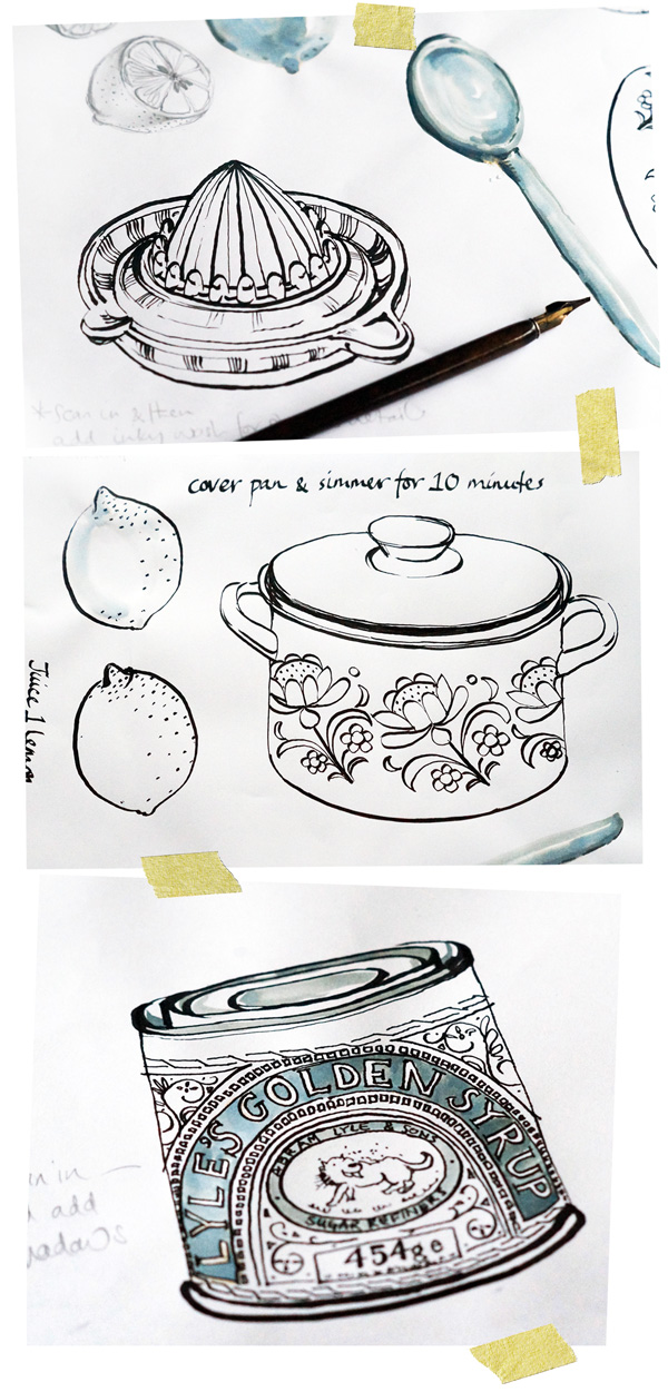
Sometime ago I blogged about some kitchen and food illustrations I'd been working on, and here is the finished result.  The illustrations were to accompany recipes for the Kyneton Kitchen Cookbook, put together by the hard-working mums of the Kyneton Playgroup (myself included!)    


It was a great project to work on as I really just created my own brief.  I'd been wanting to work on some more food-based illustrations for a while, and also to experiment with working in a linear style with pen and ink. 
The majority of the illustrations were based on things in my kitchen such as condiments, bowls, saucepans and utensils, and of course I tried to ensure that the illustrations matched the recipes.  As well as creating the illustrations, I managed the overall layout and design of the book, so it was great to play at being a graphic designer for a while! 


I loved working on all the illustrations and creating the foody artwork, and it made a really nice change to be in charge of my own brief and not to be restricted by the usual commercial constraints.  The freedom of working with a dip pen instead of my usual watercolour technique, and creating a more 'simplistic' range of artwork in a limited colour palette was really refreshing and I hope to get the chance to work on similar food-based illustrations in the future.     
 

Teacup etchings

A few weeks ago I wrote about an etching workshop I did with Bridget Farmer and I've finally managed to find time to photograph some of the prints from my weekends work.  As well as some black and white etchings, I managed to produce several coloured artworks of my favourite teacups.      
 
The top image was my biggest print, with all three teacups printed onto one sheet of paper, whilst the rest of the prints were single teacups. 
Such a fun weekend and great to learn a new process which is totally different to how I normally work.  Thanks again Bridget x    

Kitchen sketches & illustrations

During the past few weeks I've been working on some sketches and illustrations, based on
things in the kitchen - pots and pans, utensils, food items and condiments etc. The majority
of the sketches have been created using an ink dip pen - I don't very often use a dip pen to
do my artwork, so it's been a fun excercise to practise with this medium and experiment
with drawing in a slightly different way.

As a left-handed person I've had to get special left-handed nibs to use, and I don't think I'm
holding the pen 'correctly', but I like the effect nontheless and I've gradually started to find
my way with how to acheive the quality of line I'm after. I've predominantly used a Speedball
C-3 nib for the outlines, and a much thinner C-6 nib for any fine detailed areas.


Several of the illustrations have been created quite loosly with ink and a paintbrush, or I've used a wash of ink to add in a few subtle shadow details.  I've found the ink dip pen forces me to be quite simple with linear markings, but I like how the contrast between thick and thin lines is enough to create a sense of detail, perspective and shadow in a very minimal way.         

Kitchen Table Memoirs - Illustrations


Pencil sketches and watercolour artworks for the Kitchen Table Memoirs book illustrations


A few weeks ago I blogged about a new book called Kitchen Table Memoirs, where I had the fantastic opportunity to illustrate the front and back cover for the book.  I thought I'd include some of the illustrations I produced for the book, and how I approached the project.

After being briefed by the publishing company and given a list of suggested objects for the cover, I initially produced some preliminary pencil sketches to show my interpretation of the objects and the vintage-esque feel.

Once the initial sketches were approved, I moved onto painting them using Watercolours and Arches Watercolour paper in a Medium finish, 300 gsm weight.  This is my preferred paper to paint onto - I like having a slight 'tooth' to the paper, and the Medium finish is perfect for being not too smooth nor not too rough.  I stretched the sheets of paper onto board so they wouldn't buckle, and sketched out the objects lightly in pencil before painting them.

The finished painted artworks were scanned into Photoshop at a high resolution, where I could tweak the odd colour and clean up the images.  Each individual painted object was then placed into Illustrator, allowing me to create and assemble different layout options for the front and back cover.

This was a great commissioned project to work on, and it was very exciting to see the finished illustrations on the front cover of a book :)