Showing posts with label inks. Show all posts

New Blue Willow tea towel range.... and a new home for my ramblings


My last blog post was two years ago!  Hard to believe two years has passed, in some ways it feels like five minutes ago - and other times it feels like a lifetime.

It has been incredibly hard trying to maintain a small business involving commercial freelance design work for clients, with my own product range, and having two small children!  A few things have had to slide in order to remain sane and not be too overwhelmed and swamped with life - one of which has been this blog.

So, for now I'm using Facebook and Instagram to communicate and share work and a few personal things I'm involved with.  I've loved writing this blog and connecting with people, and hope that some of you might pop over and say "Hello" over there!

I'm leaving with some images of my latest 'Blue Willow' tea towel range.  Launched a few months ago in October 2016, it's the culmination of a years work in between a baby growing into a toddler, a toddler growing into a pre-schooler, new clients and freelance projects - and that big thing that gets in the way called life!!

Based on my inky illustrations of the famous Willow pattern, and all taken from my own collection of Willow dinner plates, side plates, jugs and teacups etc.  You can head over to my online shop to see more information and images.

Kitchen sketches & illustrations

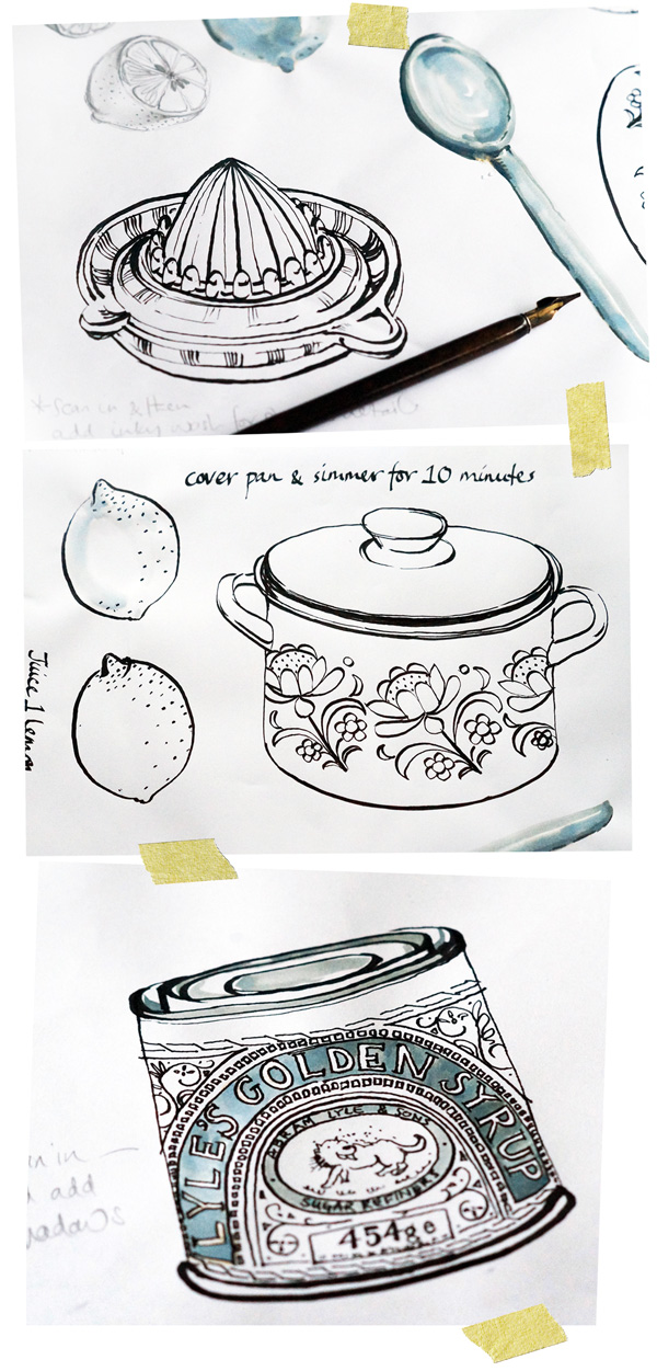
During the past few weeks I've been working on some sketches and illustrations, based on
things in the kitchen - pots and pans, utensils, food items and condiments etc. The majority
of the sketches have been created using an ink dip pen - I don't very often use a dip pen to
do my artwork, so it's been a fun excercise to practise with this medium and experiment
with drawing in a slightly different way.

As a left-handed person I've had to get special left-handed nibs to use, and I don't think I'm
holding the pen 'correctly', but I like the effect nontheless and I've gradually started to find
my way with how to acheive the quality of line I'm after. I've predominantly used a Speedball
C-3 nib for the outlines, and a much thinner C-6 nib for any fine detailed areas.


Several of the illustrations have been created quite loosly with ink and a paintbrush, or I've used a wash of ink to add in a few subtle shadow details.  I've found the ink dip pen forces me to be quite simple with linear markings, but I like how the contrast between thick and thin lines is enough to create a sense of detail, perspective and shadow in a very minimal way.         

Inky florals

Inky florals painted with food colour!
It's been a busy few weeks and amongst other things I've had a few freelance jobs on the go.  One of which has been an inky floral design for textile application.  The final artwork was to be black and white, but I painted the original artwork using blue food colour! 

I experimented with a few different inks, but I really liked the effect of the food colour and decided to paint the flowers using the blue food colour, and alter the finished artwork to black and white on the computer.

I've painted with food colour before - and it gives surprisingly good results!  You can mix the four basic colours they come in (yellow, blue, red and green) and the added bonus is you can bleach out food colour, which you can't do with many professional artists inks.  It's amazing the results you can acheive from a little bit of experimentation with a kitchen cupboard staple. 

Fruity sketches

 
Strawberries painted with inks and watercolours, with the inside of a bank envelope and map pages to also create a collaged strawberry!    


More map pages to create collaged apples along with the letraset transfers.
I've been playing around with some 'experimental' sketches and combining watercolour, inks and collage elements into the sketching process.  It's been really fun to let go and not think too much about what I'm drawing, but just to let my hand do the talking so to speak! 

None of these sketches were mapped out first or roughly sketched in pencil - I simply dived straight in with paintbrush and paints, and started quickly drawing what I saw in front of me.  I was trying not to spend too much time drawing or perfecting the fruity props, but to just quickly layer inks and watercolours and keep things simple.

For the collage elements I used a mix of old map pages, the insides of envelopes and any scrap patterened papers or fabrics that suited the subject matter.  I also bought some letraset letter transfers, and used these to add the names of the fruit - I like the combination of 'formal' and structured lettering against the washy fluid sketches.

Happy sketching!

Coffee pot sketches & collages

I've been experimenting some more with my ink pen, sketching my tea and coffee pots and also adding in some collage backgrounds and details.
Here I've added some collaged coloured paper to replicate the colourful pattern around the top of the old Studio Meakin coffee pot.
Normally my work is so colourful when painting with watercolours, so I quite like the monotone black and white contrast acheived with the black ink pen.  Working with the ink pen also forces me to simplify what I'm drawing, as I can't add all of the shadows and subtle details that I can with paint.
I've also liked using torn newspaper print as a background to draw onto as it reinforces the simple black and white palette, and helps to add some detail and surface interest - whilst keeping the drawn images to a minimum.
Off to put the kettle on now!....  

More kitchen illustrations & sketches

I've been messing around with sketching some more of my collection of cups, teapots and kettles!
I've been exploring using different media to acheive different effects, and also incorporating some collage elements into the sketches.  I've been working 'blind' by just applying paint direct to paper - without putting down any pencil outlines first!  It can be a bit scary at first - but I love the freedom of working so direct and letting the paintbrush dictate the finished outcome.
I've also been inspired by seeing the work of Kat Chadwick on The Design Files recently - and bought myself an ink dipping pen to experiment with!!  Ooh - I love new media to experiement with, and this has been lots of fun!

Sketches


I've made it a new years resolution to get back into sketching, drawing and painting on a more regular basis - and I've been feeling inspired now I have lots of colourful and patterned vintage china and kitcheny things around me.

I'm trying not to think too much about what I'm painting, but just to 'let go' and get back into the swing of drawing in a more expressive manner.

I find it takes me a while to losen up, and not make everything too perfect or 'finished'. Often the design / illustration work I'm commissioned to produce requires for more realistic artwork, so with these sketches I'm doing just for me I want to get back to not worrying about how realisitc the drawings are and just have some fun with painting.

The sketches seen here are a mix of watercolours, line and wash, quink ink and gouache.

Making a start

Making a start is always the hardest part..... I have been wondering how or where to start this blog - and have decided perhaps the easiest way is with the artwork created for the blog itself!

This is the finished artwork. I often paint at my kitchen table - it is a great 1950's-ish table (just look at the fantastic surface pattern!) I have lots of natural light flooding in through the kitchen window and the table offers a great height for painting (it also helps enormously that I am inches away from the kettle and tea-bags!)

The artwork was painted in a quick washy style using black quink ink, and then bleaching back into the ink to create the subtle detail. I love the fluidity of painting with ink, especially the movement you get as the colour bleeds into the watery surface. There is something I like about the loss of control - and how the image slowly transforms whilst the ink continues to move and bleed until dried.

I also like working with black quink ink because unlike the name suggests there is actually a surprising amount of colour in it when allowed to bleed out - look at the above detail and along with the delicate washes of grey you can also see blues and orangy-yellows emerging.