Showing posts with label Illustration. Show all posts

New Blue Willow tea towel range.... and a new home for my ramblings


My last blog post was two years ago!  Hard to believe two years has passed, in some ways it feels like five minutes ago - and other times it feels like a lifetime.

It has been incredibly hard trying to maintain a small business involving commercial freelance design work for clients, with my own product range, and having two small children!  A few things have had to slide in order to remain sane and not be too overwhelmed and swamped with life - one of which has been this blog.

So, for now I'm using Facebook and Instagram to communicate and share work and a few personal things I'm involved with.  I've loved writing this blog and connecting with people, and hope that some of you might pop over and say "Hello" over there!

I'm leaving with some images of my latest 'Blue Willow' tea towel range.  Launched a few months ago in October 2016, it's the culmination of a years work in between a baby growing into a toddler, a toddler growing into a pre-schooler, new clients and freelance projects - and that big thing that gets in the way called life!!

Based on my inky illustrations of the famous Willow pattern, and all taken from my own collection of Willow dinner plates, side plates, jugs and teacups etc.  You can head over to my online shop to see more information and images.

Watercolour teacup illustrations

A few weeks ago I posted about some teacup artwork I had been comissioned to work on.  I'd been asked to create a watercolour piece for a 40th birthday gift, featuring some of the recipients vintage teacups and saucers handed down from her Grandmother.  It's been a really lovely project to work on, and very special that it was a for a significant birthday gift as well as the really personal element with the family heirloom china. 
After selecting the chinaware to use and placing it into a suitable arrangement, I started the illustration by sketching out the individual pieces directly onto Arches Smooth 185gsm Watercolour paper.  I then initially applied light washes of grey hues to the teacups, gradually building up the layers to create the shape, form and shadows of each teacup.
 
Once the shading was completed I started to paint the gold rims of each cup, followed by the detail of each cups pattern over the top of the grey shadows.  Again this was done with washes of colour, starting quite lightly and free and gradually building up to the finer details and intricate patterns.   
This is the finished illustration featuring four teacups and two saucers.  I was really pleased with the artwork, and despite being a little intimidated about painting a piece to be a framed picture and not being able to correct any mistakes on the computer, I thought it turned out quite well! 

The North Wind & The Sun - Illustrations by Brian Wildsmith

I was really pleased to come across this book at the local op-shop, because it features the wonderful lively and quirky illustrations of one of my favourite illustrators, Brian Wildsmith, who I've blogged about previously with his books The Owl and the Woodpecker and Python's Party
The book is called "The North Wind and The Sun" and is a fable by La Fontaine, first published in 1964. The fable centres around the Northwind and the Sun, and how they compete by different methods to get the horseman to remove his new cloak.  
The fable has a great moral lesson (see below) but it's the whimsical and playful illustrations that transform this story into a delightful book to look at and read.  Using a multi-media approach Wildsmith's imagery mixes gouache, some kind of crayon or oil pastel (I imagine the latter), collage and inks to create his trademark expressive illustrative style full of energy and movement. 
"The North Wind and The Sun" - A Fable by La Fontaine:

One morning the North Wind and The Sun saw a horseman wearing a new cloak. 

"That young man looks very pleased with his new cloak" said the North Wind.  "But I could easily blow it off his back if I wanted to"
"I don't think you could" said the Sun.  "But let us both try to do it.  You can try first."

The North Wind began to blow and blow and blow.  People had to chase after their hats.  Leaves were blown from the trees.  All the animals were fightened.  The ships in the harbour were sunk.  The North Wind blew with all his might, but it was no use, for the horseman just pulled his cloak more tightly around him.

"My turn now," cried the Sun.

And as he gave out his gentle heat, insects hummed and flowers opened.  The birds began to sing.  The animals lay down to sleep.  And the people came out to gossip.  The horseman began to feel very hot, and when he came to a river he took off his clothes and went for a swim.

So the Sun was able to acheive by warmth and gentleness what the North Wind in all his strength and fury could not do.

A great lesson for us all I think!

Farmhouse Home illustrations

Just before Christmas I was commissioned to create some illustrations for Catherine Bedson's Farmhouse Home blog, which is a blog essentially celebrating food. Catherine cooks delicious food and shares rustic, country style recipes, as well as doing reviews of local cafes in Melbourne and book reviews.
Catherine was looking to re-vamp her blog and wanted some hand-drawn illustrations to accompany the new design. The illustrations were to form the actual header and overall branding, as well as individual icons for the menu tabs.  The illustrations had to reflect the easy country style of her food, but also something that would capture the homely and personal feel of the blog.   
We made the decision early on to purely create the illustrations in black and white, and in a sketchy hand-drawn style.  The image above, and the following images below show some of the sketches and work in progress to get to the final illustrations. 
 
All of the illustrations were completed using a HB and B pencil, onto plain paper.  The sketchy style of the illustrations was used to convey a relaxed and homely feel, and the monochromatic colour palette helped to keep it simple but contemporary. 

One of my favourite parts of the brief was to sketch Catherine's dog Charlie - who was very cute! 

Over on the Farmhouse Home blog currently is a little interview Catherine did with me about my artistic background, and I also shared one of my favourite recipes.  Yum!  You can see it here.

'It's Time to Talk', tea illustrations for Aware mental health campaign


I was approached towards the end of last year by the charity Aware, a non-profit organisation in Ireland, which offers support and information for people who suffer from depression.  They wanted to use some of my tea illustrations to launch their latest campaign 'It's Time to Talk'.....about mental health, for their website and facebook sites.
The illustrations chosen by Aware were from a blog post sometime ago, where I did a series of sketches experimenting with ink pen and collage techniques.  I was delighted to donate the illustrations to such a worthy cause, and help support their campaign to get people in Ireland to host coffee mornings and chat about mental health.         

The sketches were originally done for personal experimentation and enjoyment, so it was great they ended up being useful and serving a much greater purpose.  For more information about the 'It's Time to Talk' campaign just visit Aware.     

Kyneton Cookbook Illustrations


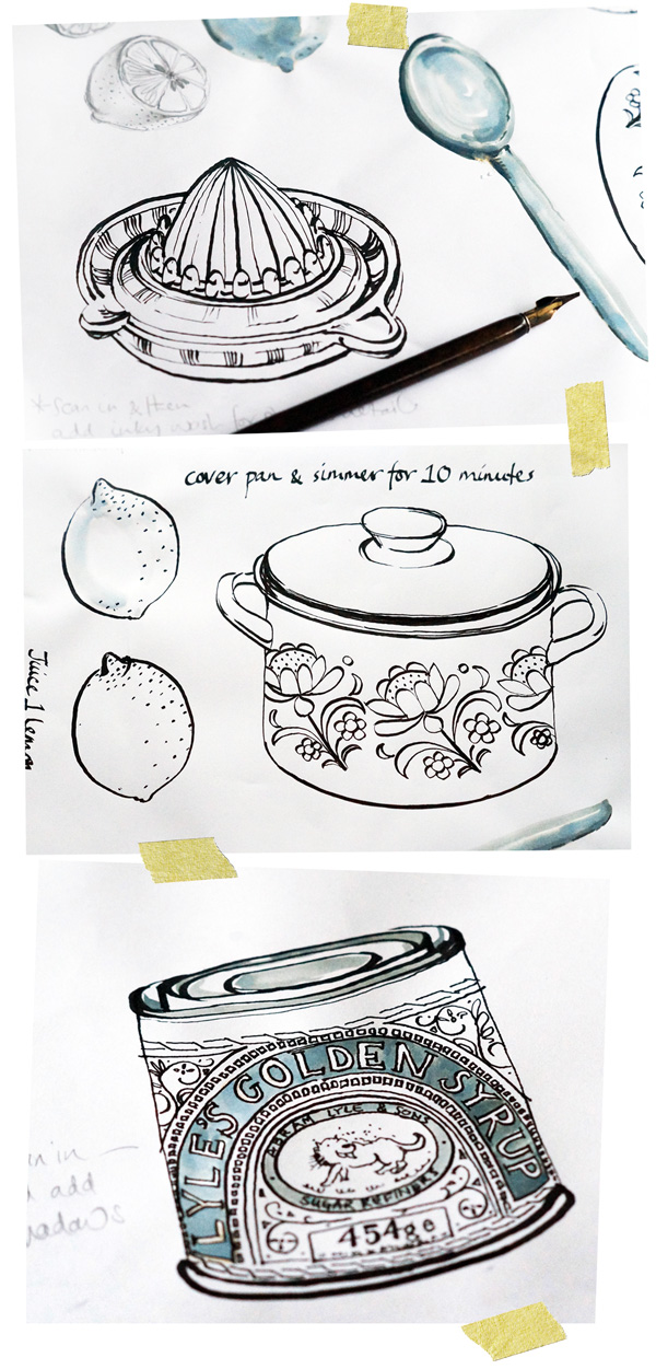
Sometime ago I blogged about some kitchen and food illustrations I'd been working on, and here is the finished result.  The illustrations were to accompany recipes for the Kyneton Kitchen Cookbook, put together by the hard-working mums of the Kyneton Playgroup (myself included!)    


It was a great project to work on as I really just created my own brief.  I'd been wanting to work on some more food-based illustrations for a while, and also to experiment with working in a linear style with pen and ink. 
The majority of the illustrations were based on things in my kitchen such as condiments, bowls, saucepans and utensils, and of course I tried to ensure that the illustrations matched the recipes.  As well as creating the illustrations, I managed the overall layout and design of the book, so it was great to play at being a graphic designer for a while! 


I loved working on all the illustrations and creating the foody artwork, and it made a really nice change to be in charge of my own brief and not to be restricted by the usual commercial constraints.  The freedom of working with a dip pen instead of my usual watercolour technique, and creating a more 'simplistic' range of artwork in a limited colour palette was really refreshing and I hope to get the chance to work on similar food-based illustrations in the future.     
 

Kitchen sketches & illustrations

During the past few weeks I've been working on some sketches and illustrations, based on
things in the kitchen - pots and pans, utensils, food items and condiments etc. The majority
of the sketches have been created using an ink dip pen - I don't very often use a dip pen to
do my artwork, so it's been a fun excercise to practise with this medium and experiment
with drawing in a slightly different way.

As a left-handed person I've had to get special left-handed nibs to use, and I don't think I'm
holding the pen 'correctly', but I like the effect nontheless and I've gradually started to find
my way with how to acheive the quality of line I'm after. I've predominantly used a Speedball
C-3 nib for the outlines, and a much thinner C-6 nib for any fine detailed areas.


Several of the illustrations have been created quite loosly with ink and a paintbrush, or I've used a wash of ink to add in a few subtle shadow details.  I've found the ink dip pen forces me to be quite simple with linear markings, but I like how the contrast between thick and thin lines is enough to create a sense of detail, perspective and shadow in a very minimal way.         

Little Golden Book - Animal Book


Cats cuddle. Cats purr. Nothing's as smooth as cats' fur.
Mice scuttle. Mice squeak. When the cat's about, Mice sneak.


Owls hoot and Owls blink. No one knows just what Owls think.


I'm always on the hunt for second-hand Little Golden Books, and I've collected some fabulous ones recently.  One of my favourites is this My Little Golden Animal Book, which is full of very cute animal illustrations - farm animals, domestic animals, flying animals and swimming animals are all here.

The book is dated 1963 and features little rhyming dities to accompany each animal, with the very sweet illustrations drawn by Moritz Kennel. 

Portraits....landscapes....life drawing....and more.....


Little Mr J turned two last week, and I received a surprise birthday card featuring a portrait of him that my dad had painted.  The watercolour portrait is only small being on a birthday card, but it captures him (and his best friend, the Jolly cat) perfectly.
 
I've never really painted portraits, so I'm always in awe of people who can do this as I think it has to be one of the hardest things to paint.        
 
My dad has been updating his blog with recent paintings from his home in Ireland, work from a few years ago whilst living in Southern France and prior to that England, as well as sketches and paintings from his sketchbook.  The two paintings below are recent oils depicting moody skies and iridescent landscapes in Ireland.       
The scene below is a watercolour landscape of Ireland, and lastly a painting of Norfolk taken from his sketchbook. 
Recently my dad has also started some still life classes, painting nudes.  You can see more of his figure studies here and here.     
I have recently had the opportunity to paint the female figure for only the third time since leaving art-college, more years ago than I prefer to remember. Painting the human figure presents unique challanges very differnt to landscape or still life. It is, I believe, all in the drawing, getting the balance, form and proportions right. There are no straight lines, no definite angles or corners to take measurments from, coordination of eye and hand are paramount.
 And lastly here is a video featuring some of his current work.  Enjoy!   


Charley Harper


The fabulous graphic-style illustrations of Charley Harper


I'm a big fan of the work of American illustrator Charley Harper, and some time ago I received this fabulous book Charley Harper an Illustrated Life, compiled by Todd Oldham, to add to my book collection. 

Charley Harper was a prolific American artist - born in the 1920's he started producing commercial work in the 1950's, and continued to produce commercial art, illustrations, posters, book illustrations, mosaics and silk screens throught his life.  With an instantly recognisable style, he was renowned for his highly stylised wildlife interpretations and modernist style. 

I love Charley Harper's very graphic and simplified style, with flat (almost computer-like) shapes and use of geometric patterning to convery texture and depth - instead of any shading.  He also has a fabulous quirky take on his subject matter - just look at his representation of the Australian Koala and the back scratching baboons.  

I'm totally in awe of his pared-back style, and find it amazing that his illustrations were hand-painted and not created on a computer!  His simplified and stylised artwork translates perfectly to silkscreen prints, particularly his bird series which culminated in his 'Birds & Words' book in 1974.

Above is a very tiny snippet of the very fabulous artworks in the book.  You can find more information about Charley Harper and his work here

Kitchen Table Memoirs - Illustrations


Pencil sketches and watercolour artworks for the Kitchen Table Memoirs book illustrations


A few weeks ago I blogged about a new book called Kitchen Table Memoirs, where I had the fantastic opportunity to illustrate the front and back cover for the book.  I thought I'd include some of the illustrations I produced for the book, and how I approached the project.

After being briefed by the publishing company and given a list of suggested objects for the cover, I initially produced some preliminary pencil sketches to show my interpretation of the objects and the vintage-esque feel.

Once the initial sketches were approved, I moved onto painting them using Watercolours and Arches Watercolour paper in a Medium finish, 300 gsm weight.  This is my preferred paper to paint onto - I like having a slight 'tooth' to the paper, and the Medium finish is perfect for being not too smooth nor not too rough.  I stretched the sheets of paper onto board so they wouldn't buckle, and sketched out the objects lightly in pencil before painting them.

The finished painted artworks were scanned into Photoshop at a high resolution, where I could tweak the odd colour and clean up the images.  Each individual painted object was then placed into Illustrator, allowing me to create and assemble different layout options for the front and back cover.

This was a great commissioned project to work on, and it was very exciting to see the finished illustrations on the front cover of a book :)